
Decorating with Living Coral the Pantone Colour of the Year 2019
- Gina Everett
- Dec 13, 2018
- 4 min read

Pantone have made their hotly anticipated announcement for the Colour of the year 2019 and it is… Living Coral.
Described as “vibrant yet mellow, living Coral embraces us with warmth and nourishment to provide comfort and buoyancy in our continually shifting environment.”
According to Pantone the colour represents “the fusion of modern life, Pantone Living Coral is a nurturing colour that appears in our natural surroundings and at the same time displays a lively presence within social media.”

It is a lovely, lively colour and one that immediately immerses you in warm feelings for the sunnier side of life. Unlike the past couple of years where Pantone have gone against the grain with the unpredictable choices of Greenery and Ultra Violet, Living Coral is a colour which is already on the trending radar. Back in February I wrote about the Terracotta colour trend and I’ve since lost count of the times shades of terracotta, salmon pink, rust and coral have appeared styled on the pages of Elle Decoration. Along with The Dulux colour of the Year Spiced Honey the aesthetic is definitely appealing for a dose of vibrant optimism with a comforting warm glow.
How to Style Living Coral
Go Bold
As a surface colour it creates a vibrant background. Using Living Coral on walls, floors or ceilings is a bold statement. If you are going to use it as a main wall colour you must be a certified colour lover and be sure this really is something that really does suit the style of your home as this colour will not simply blend into the background.
In these two examples where Coral features as a background wall colour. In one the Coral colour is matched with a rainbow of colour creating bright and colour filled shelves in this home office library.
Below the coral creates a more sedate scheme in this colonial style room. Paired with natural dark woods and black accents. Monochrome and the natural tones of wood are good match for most bright colours. The black and white allow the colour to shine without any competition and the the warmth of wood brings the beauty of nature into the colour scheme.
Break it up with Pattern
Use pattern on your surfaces to break up the colour. It's a simple way of introducing with the colour without the commitment of a flat wall of colour.
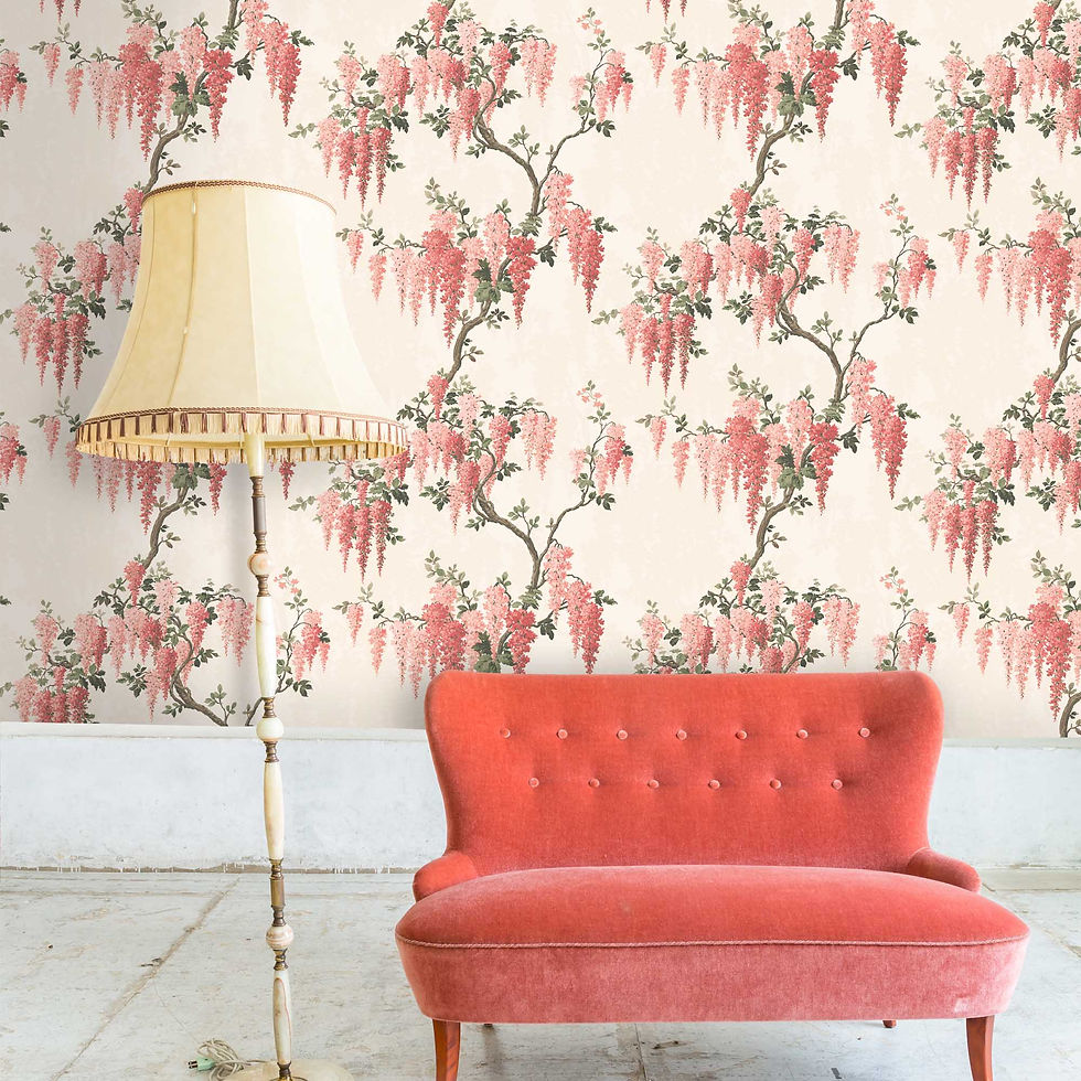
Image: Woodchip and Magnolia featuring Wisteria Wallpaper in Coral by Pearl Lowe
There are also lots of choices of how to add the colour in this way. A patterned wallpaper, large artwork, curtains or upholstered furniture are all great ways to showcase the colour in your home.
The Colour Pop
This is where I think that Coral really comes into it's own. It is such a lively and playful colour that it works when (thoughtfully) placed where you would least expect it.
In this lounge for example where the theme of the coral collection brings the bright living coral colour into play with the statement chairs and the quirky light fixture.
Who would have expected to see coral in this all white home design? It makes you stand up and take notice of those beautiful chairs. These chairs are probably very expensive designer pieces however painting chairs is a great way to add the colour into your scheme with a cost effective upcycling project.
A neutral bedroom scheme with a pop of coral colour. The neutral browns, whites and blacks tone down the colour but bring an overall warmth to the scheme.
Mix and Match
Aquatic themes are set to be a huge trend next year which fits in nicely with coral as blue/green tones as not only are complementary to coral on the colour spectrum but coral is essentially a living sea creature. The two colours do work really well together. As well as following on nicely from the terracotta and teal pairing which was a leading colour trend last year.
Here a bright shade of coral combines with blue to create and eclectic mix. Mustard is another of this seasons trending colours which looks lovely in this design scheme.
If the bright tones are too much for you existing home decor scheme use more muted tones alongside pastel blue and green tones to ring in the changes.
Finally if you prefer a more subtle colour infusion coral looks lovely with the ever popular shades of blush pink. These are also good colours to use in rooms which don't get much natural light. The light pink reflects light really effectively and the coral warms up the room.
Will you be adding coral colours into your home decor this year? I'd love to know so leave a comment if you have some changes in mind. Here is my pick of all things coral to add to your home.

Clockwise from top left
Grassington Sofa in Tango Velvet Flamingo from sofasandstuff.com - £2,128
Merino Wool Parquet Blanket in Coral by Bronte by Moon from hurnandhurn.com £56.95
Elizabeth Scarlett Palmier Cushion from Amara.com - £50
Ligne Roset Toa Armchair from ligne-roset.com/uk
Caravan Dresser from Cuckooland.com - £1,190
Task Lamp in Goldfish from annabeljames.com - £59.95
Klevering Round Plate Lobster from printandtailor.com - £27.50
Wedgwood Paeonia Mug in Coral from Amara.com - £30
Annie Sloan Chalk Paint Coral Mix using Tilton and Emperor's Silk Portrait
Keep up to date with our latest offers and competitions by following Create Perfect on Instagram


Comments